

This Is Why So Many Logos Are Red
Updated: Nov. 27, 2022
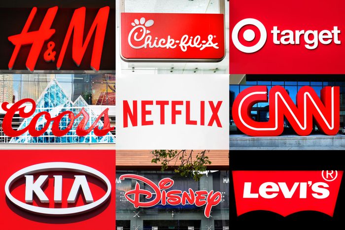
Yep, there's a scientific reason behind why you can't resist those bright red logos you see everywhere.
There’s a reason you can’t resist the siren call of the McDonald’s logo or the Coca Cola logo. What is it about these company signs that make people stop in their tracks? They share a common color: red. That’s not by accident. People make judgments within a minute and a half of seeing a person or an object, according to the digital marketing firm WebpageFX. And as much as 90 percent of that impression is based on the color alone. Marketers use certain colors in their logos or advertisements to evoke emotions and feelings that encourage people to buy, says Emily Carter, a web marketing analyst for WebpageFX.
RELATED: Colors You Shouldn’t Have in Your Bedroom
Why red?
So what is it specifically about the color red?
“Red is associated with increased heart rate, and it’s used to create a sense of urgency,” Carter says. “This is why you’ll often see red tags for clearance sales.”
The photo receptors in your eyes are particularly sensitive to long wavelength light, which we see as red.
“There’s an incentive to make logos red because red is the most visible color,” says Bevil Conway, a neuroscientist and artist with the National Eye Institute. He and other researchers have studied how color translates across languages.
“There’s overwhelming evidence that red is a special color,” Conway explains. “Of all of the colors, around the world, in all of the world’s languages, we communicate red most efficiently.”
The color can be associated with both positive and negative emotions, which figures into how companies use it. Red may be angry and aggressive at stop signs, or it can signal love and seduction and Valentine’s hearts. But it always stands out.
RELATED: What Company Logos Looked Like When They Were Young
Why do so many fast food chains use red?
Aside from just grabbing our attention, the color red stimulates appetite and hunger. You may not even realize it, but the color red will make you want to eat.
“The color red is said to stimulate appetite, and it’s used by a number of restaurants, food, and beverage brands like McDonald’s, Coca-Cola, and Kellogg’s,” explains Carter. Even the 7-Eleven logo has a splash of red it in!
Red is typically paired with yellow in fast food company logos to add a feeling of happiness and comfort, according to the psychology behind color. Some marketing professionals have even labeled the success of the striking pair of red and yellow as the “Ketchup and Mustard Theory.” Through this combination of bright colors, we are subconsciously thinking about eating.
RELATED: Colors You Shouldn’t Have in Your Home
What other colors influence us?
You may be thinking that not all fast food logos are red and yellow. Take the Starbucks logo, for example. Brands that typically try to advertise themselves as “healthy” and “environmentally friendly” use Earth tones such as green. The color green creates a feeling of relaxation and nature. This is why it’s so popular among organic companies such as Whole Foods, Morning Star, and Tropicana.
You will rarely see blue on a food label, as blue is proven to curb appetite. Blue is the color of productivity and is used to create a sense of trust in the brand. This goes for logos such as Ford, American Express, and Chase.
Any logo that uses pink is likely targeting women, as pink is most closely associated with being feminine. People see pink as a “sweet” color, which is also why you may notice pink on dessert logos. There is a liveliness to pink that gives off the image that the brand is “fun,” as used by Dunkin’ Donuts, Barbie, Victoria’s Secret, and Baskin Robbins.
On the other hand, colors like black and purple tend to convey a more serious, elegant, and luxurious message. Logos that use these colors want people to know that they have a reputation. Using bright colors won’t convey the exclusivity these brands are hoping for. This includes logos including ABC, The New York Times, Gucci, and Prada. Next, check out the secret messages in company logos you may not have noticed.
Sources